Clustering NBA Players with SportVu Camera Data
Posted on Wed 13 April 2016 in articles
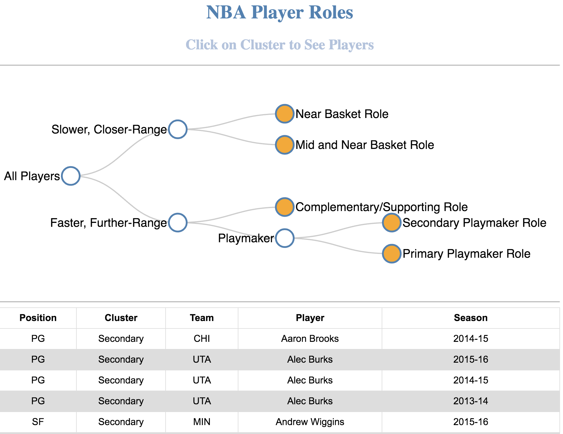
Below is a screenshot of the d3.js web app I made. It displays players which were iteratively clustered using 3D geospatial data obtained from the NBA's SportVu Cameras for three years - click here for the real version. You can see which players were clustered into which roles, and the table is sortable! Also, try clicking the non-leaf nodes - the table will update with data from the node's children!
Background
The NBA has been using SportVU Cameras to record geospatial player data at 25x per second, resulting in an explosion of data in an already statistically dense sport. In particular, new statistics involving speed and distance have emerged.
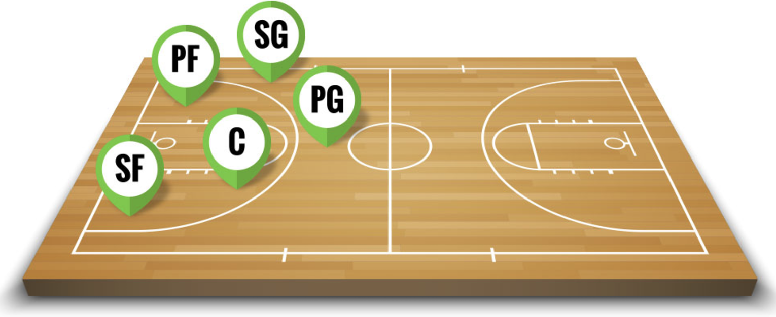
I thought these statistics would unleash new theoretical insights into player and team analytics, specifically which roles players actually fulfill. We traditionally rely on the somewhat arbitary label 'position' to describe how players fit within a team, but it is an extremely poor definition of the players actual role. If there were five roles players fulfilled (aside from positions), where would players fit in?
This new explosion of data and this inspired me to take a closer look!
Acquiring Data
Although there are many great resources for acquiring NBA data, I found one that included a rich amount of SportVu data that unleashes new insights. I didn't want to just use traditional NBA statistics, I wanted to amplify them with data only SportVu cameras were picking up --- like speeds and distances.
I scraped publicly available data from the NBAs Website, which spanned three seasons. There were 1200+ unique data points (unique players in unique seasons) and 800+ features (many with new data from SportVu cameras).
Exploratory Data Analysis
EDA is notoriously difficult in high dimensional feature spaces. Naturally, examining 800+ different features and their combinations would be a never-ending task. I wanted to reduce the dimensionality of the feature space by using Principal Component Analysis (PCA) to identify directions of large variation in the dataset. Like other variance maximizing exercises, I normalized all my features before applying PCA.
\(x_{new} = (x - \mu) / \sigma\)
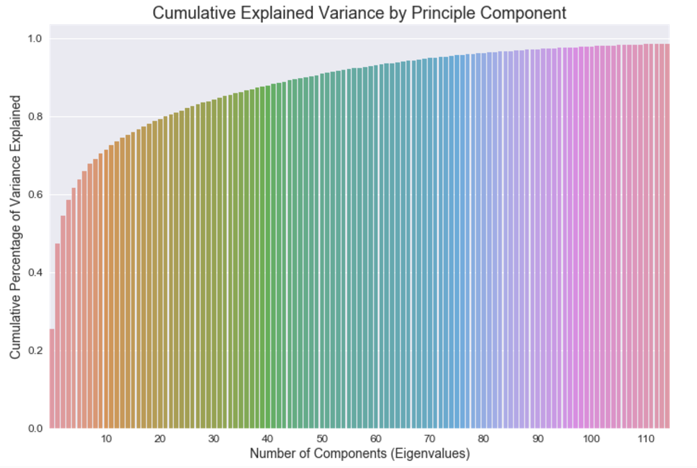
The graph below shows cumulative explained variance for each principal component. I chose 12 components because as more components are added the law of diminishing returns applies.
Modelling
I chose to iteratively use K-Means clustering because the quality of clustering took a backseat to interpretability. I wanted to create an easily interpretable visualization that was simple and understandable enough for a typical NBA fan to appreciate. Although iterative clustering misses out on the original feature space on further iterations, it provides a clear structural view of intra-cluster relationships and is highly interpretable.
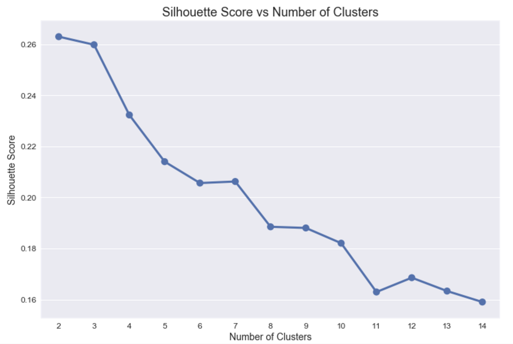
Below shows the silhoutte scores as the number of clusters increases for our first iteration using K-Means. This is a measure of inter-cluster and intra-cluster euclidean distance implying there is a strong distinction (large distance) between and within clusters.
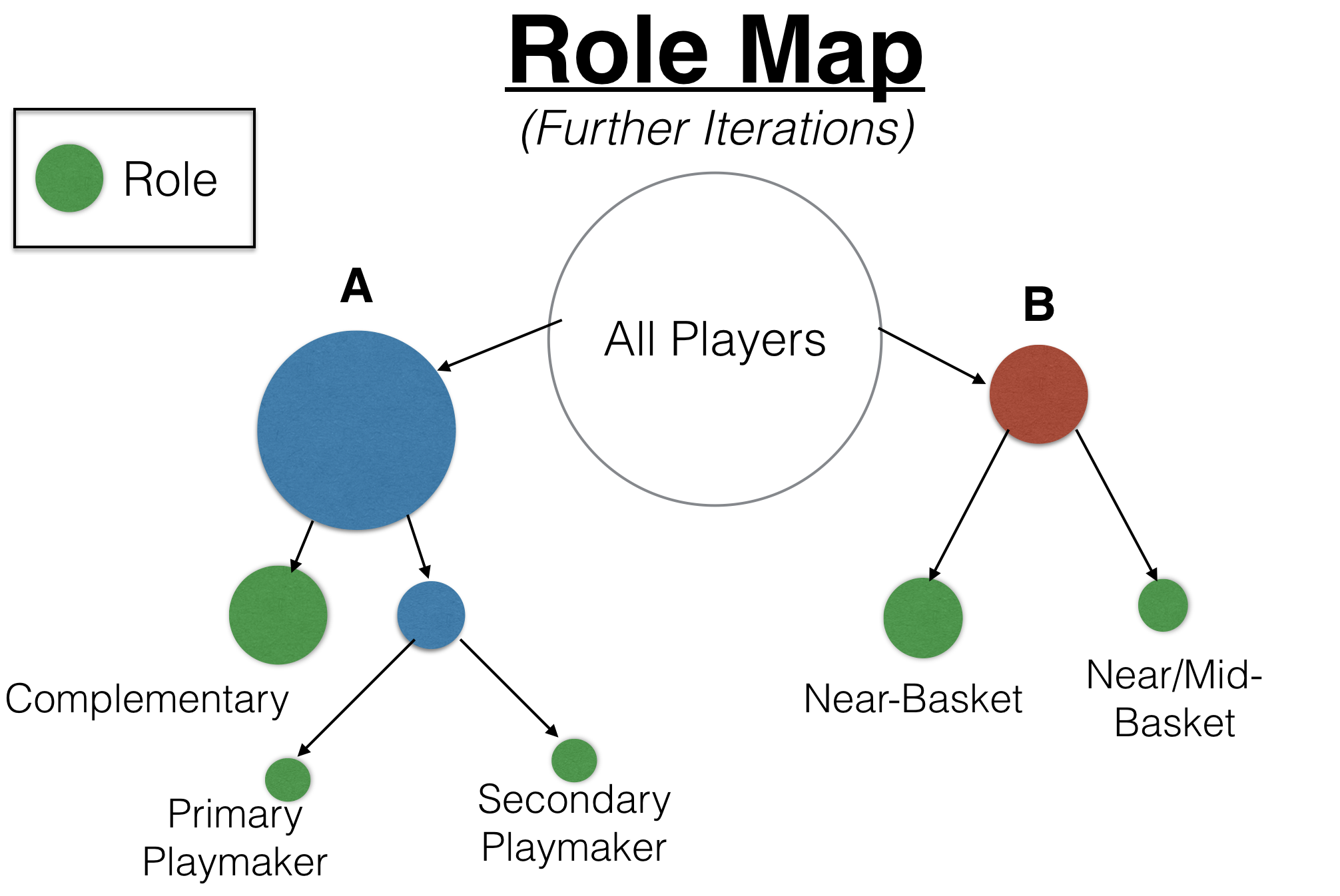
This was done iteratively until there were five distinct clusters resulting in the following role map showing the process in more detail. The role names describe the individual nodes in more detail and the leaf nodes (final nodes) are displayed in green.
After taking a closer look at specific players within each node, I noticed there are some players in counterintuitive roles for their respective positions and attributes (height, game statistics, etc.). For example, tall players are generally placed in near-basket positions such as Center because of their rebounding ability, yet there were a few exceptions within these clusters.
Below is a scatterplot of height and rebounds where values are color-coded based on their assigned cluster in the first iteration. As you can see, there are a few exceptions - most notably Dirk Nowitzki and Tony Allen. They appear to be outliers and would definitely be in different clusters had they been clustered using the statistics on the axis.
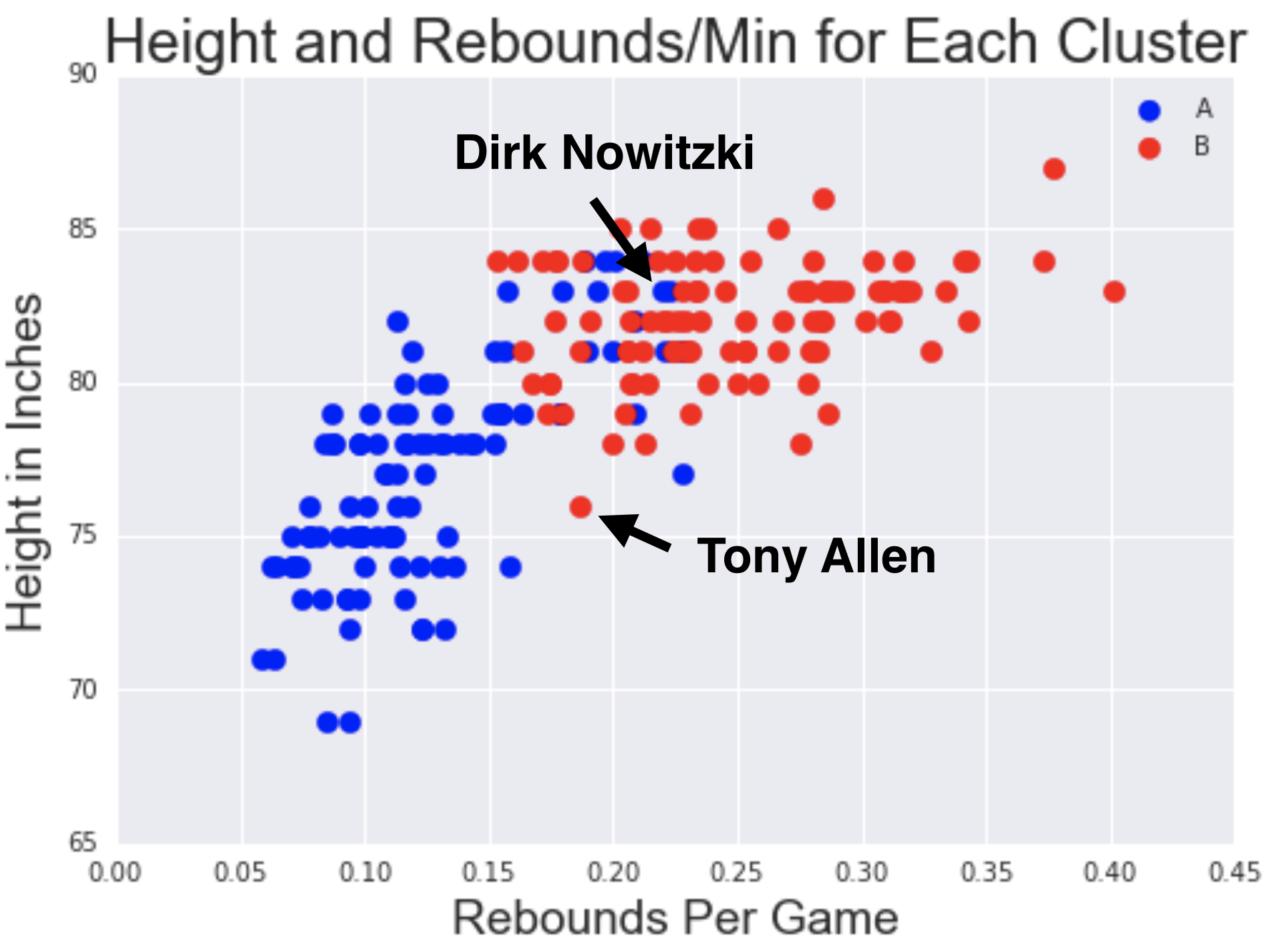
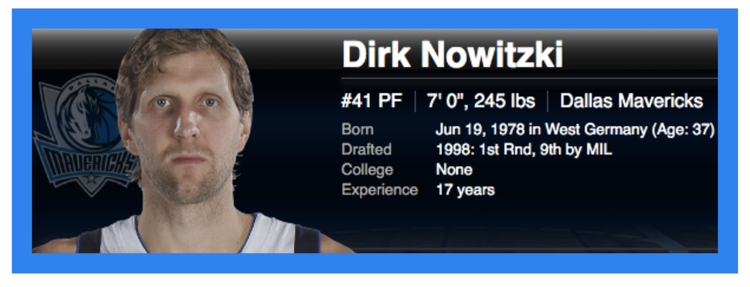
Dirk Nowitzki is actually clustered with players much smaller than he is. He has an extremely unique playing style for someone his size and shoots a lot of shots from a far distance and is fairly quick. It makes sense he is clustered with smaller sized players, but it's certainly counterintuitive. In fact, he plays more similar to a point guard or shooting guard!
At the other end of the spectrum, Tony Allen fits into the cluster which tends to contain taller players. He actually doesn't have much of an offensive game, but is an amazing defender. Most players who share his position (SG) score lots of points and drive the action of the game. However, Tony traditionally plays much closer to the basket and often defends players much larger than himself. Ironically, both Dirk Nowitzki and Tony Allen actually fill roles that are opposite of their actual positions!

Equally as interesting, players within teams shifted roles when the team dynamics changed - the same players do not have identical roles from season to season. Depending on the team dynamic, players suit different roles. For example, Draymond Green from GSW switched to a near-basket role after the 2013-14 season despite holding the same position.
Visualizing Results
I wanted to visualize both the final clusters and the iterative process and it was important for people to be able to see how players were clustered along the way. I customized a collapsable tree found here and added a sortable table. It is interesting to see where players shift and where most players with similar positions lie. D3.js collapsable trees proved to be a good choice because it's extremely intuitive and interpretable. It is really easy to see how players were clustered through each iteration and
What I learned
I learned a lot about dimensionality reduction techniques along the way. Besides PCA, I was introduced to other methods such as LDA and T-SNE and it was a valuable experience learning which technique to use. Furthermore, I learned more about various clustering algorithms and their trade-offs. It was great to explore K-Means as it is an extremely practical clustering algorithm that is more computationally efficient than others.
Although I'd used d3.js in the past, this was an entirely new experience customizing an existing template so heavily. It was definitely a lot of work, but I'm grateful for the experience and happy I learned how to mold different visualization templates to suit a specific purpose.

Further Steps
If I had more time to spend on this project, I would've explored T-SNE a bit further and done some visualizations with it. It would've been interesting to see which clusters it produced. Also, I would like to create additional features for my visualization that help filter clusters by team, position, etc. so it is even more interpretable.
I really enjoyed this project and am grateful for what I learned and accomplished. It is really empowering to do an entire project in a short time-frame - I learned a lot!